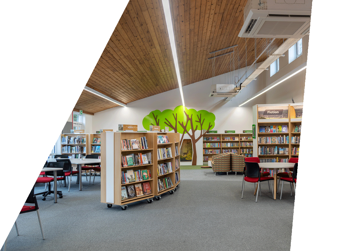
A discovery layout applies reader-centred thinking to designing library interiors. From makerspace to health offers, business support to warm spaces, our design team can help you create the best balance between traditional and new library offers
Planning a project? Contact us
Libraries come in all shapes and sizes and are now co-located with many different services. We have created a library in an 18th century church which is still used for worship; reduced the footprint of a sizeable library to accommodate a council-run gym (which paid for the refurbishment); integrated with community hubs, arts, museums and sport centres. Few building projects are as complex as a public library in terms of mix of audience, mix of equipment and varied purpose. This requires careful space planning to manage conflicting needs. Who gets the best space and why is the most difficult question in any design. There are many possible answers and they will be different every time.
At Opening the Book, we have studied the way people move through library spaces, which way they turn, how far they go, where they stop. Thousands of customer observations have built a unique bank of user behaviours. We have also collected more than 60,000 library customer interviews, gathered from our online training programmes, to understand exactly how library customers choose a book.
We apply this knowledge in our designs to create layouts which pull customers forward to explore the whole space. Views open up as you move through and books are brought into the eyeline at every turn. Our unique shelving shapes create attractive browsing spots where it is easy to step out of the flow to linger, look and take.
We work with you to fully understand your priority audiences and services. We then design a zonal scheme which gives the right balance between areas for different ages, activities and types of stock.
The example zoned plan illustrated shows a spacious quick choice and health zone (a council priority) near the entrance on the right; a large children’s area with storytime space; a dedicated teenage area separate from children (with orange carpet); IT and meeting/teaching rooms top right; local history area centre back; and a more traditional stack and study area to the left. This is zoned for length of visit and noise as well as for different customer groups.
In every library we design, we work with staff to map a detailed collection layout. We consider ratios, sequencing, and adjacencies for the best collection perfomance. We then create a merchandising plan for every bookcase with shelf settings and merchandising equipment. Everything is installed by our fitters so it is a quick job for for staff to stock the shelves before opening.
Each bay is specified as to what stock it holds, what the capacity is (this varies with product size and form of display) and what the anticipated loan rate is. Staff can use the spreadsheet to monitor performance and to plan future stock changes.
Clever space planning is essential when it comes to supporting larger events. This is not just about putting everything on wheels and sweeping it to one side. Can the layout offer an attractive backdrop for a large seated audience? Are there spaces for small group meetings while the library is open? We have designed integral spaces not only for large author events and regular rhymetimes, but also for group meetings; lunchtime presentations; health and employment one-to-one advice sessions; film clubs; table top fairs; pop-up partner promotions.